I managed OpenGov's creation of the Capital Design System at OpenGov to improve our product design process, manifest our design principles, and provide our customers with a usable, accessible, beautiful software that personifies their service to the public.
A design system is the combination of visual language, tools, technology, and people— and people are the most important part.
As I document our process, describe my roles, and show the visuals, I should call out that the biggest challenges we faced in the project were culture change, trust, and commitment to design and build the system. As this project unfolded, we developed a shared language about how we build products that helped our product and engineering organization is ways I never would have expected.
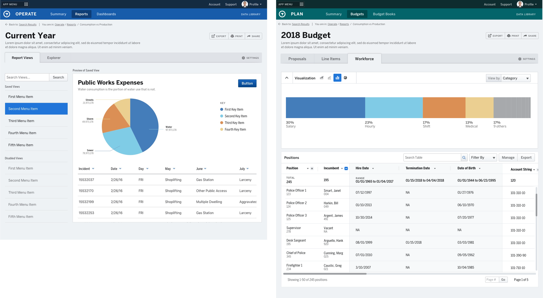
BEFORE & AFTER
Project Goals
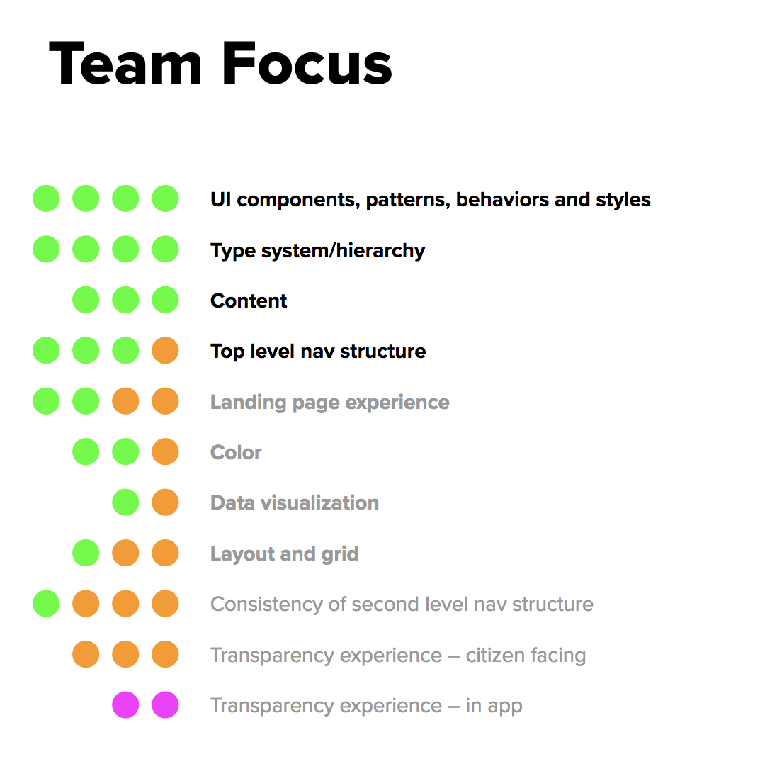
Our team goals for the project was a design language and reusable components that would increase our design and development velocity, incorporate a many learnings from customer research into the product, and reduce our time spent reinventing the wheel on solutions. We aligned these goals with our company goals for Q1 & Q2:
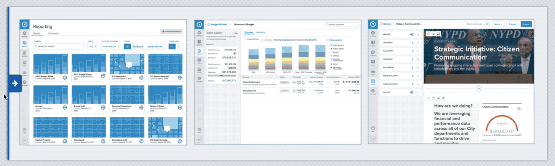
• Unify our products
Strategic Planning, Budgeting, Citizens Engagement, and Operational Performance
Strategic Planning, Budgeting, Citizens Engagement, and Operational Performance
• Fast Benefits
Provide near-term benefits to product and engineering roadmap
Provide near-term benefits to product and engineering roadmap
• Paths to Success
Improve information architecture, wayfinding, and usability.
Improve information architecture, wayfinding, and usability.
• Ease, Clarity, Consistency
Reduce product complexity and provide more clarity.
Reduce product complexity and provide more clarity.
Design Process
Here, roughly speaking, are the project stages we went through to create the design language:
• Prospect — Executive Proposal and Finding Help
• Discover — Audit, Research, Product Goals
• Explore — Inspiration and Design Language Directions
• Define & Design — Designing Components
• Document & Design — Guidelines and Code
I pitched, planned, and managed the creation of Capital, the OpenGov Design System, and worked with a team of 4 designers to envision and design the system.
I took advantage of my own super powers of reading and taking in a bunch of information to understand how other companies approach solve the problem and how we can make it happen as a small team. I talked with Brad Frost and a number of other leaders in Design System to learn and find the right consultant. We used his Atom approach as a way to finding mutual understanding between developers and designers.
Prospecting and Launch
I found and hired a talented designer, Amanda Dowd to consult with us and bring a fresh perspective to our products and problems. We also have a talented visual designer, Michael Bonfiglio, on our team who freed up time to explore visual directions with her.
Before we started the project, we did a Success-Failure exercise to surface worries about the project and build trust as a team. We also did a dot voting exercises to arrive at shared project goals and focus.
Exploration
We worked with Marketing on Brand and Voice and we’re able to make some improvements to our brand styleguide in the process.
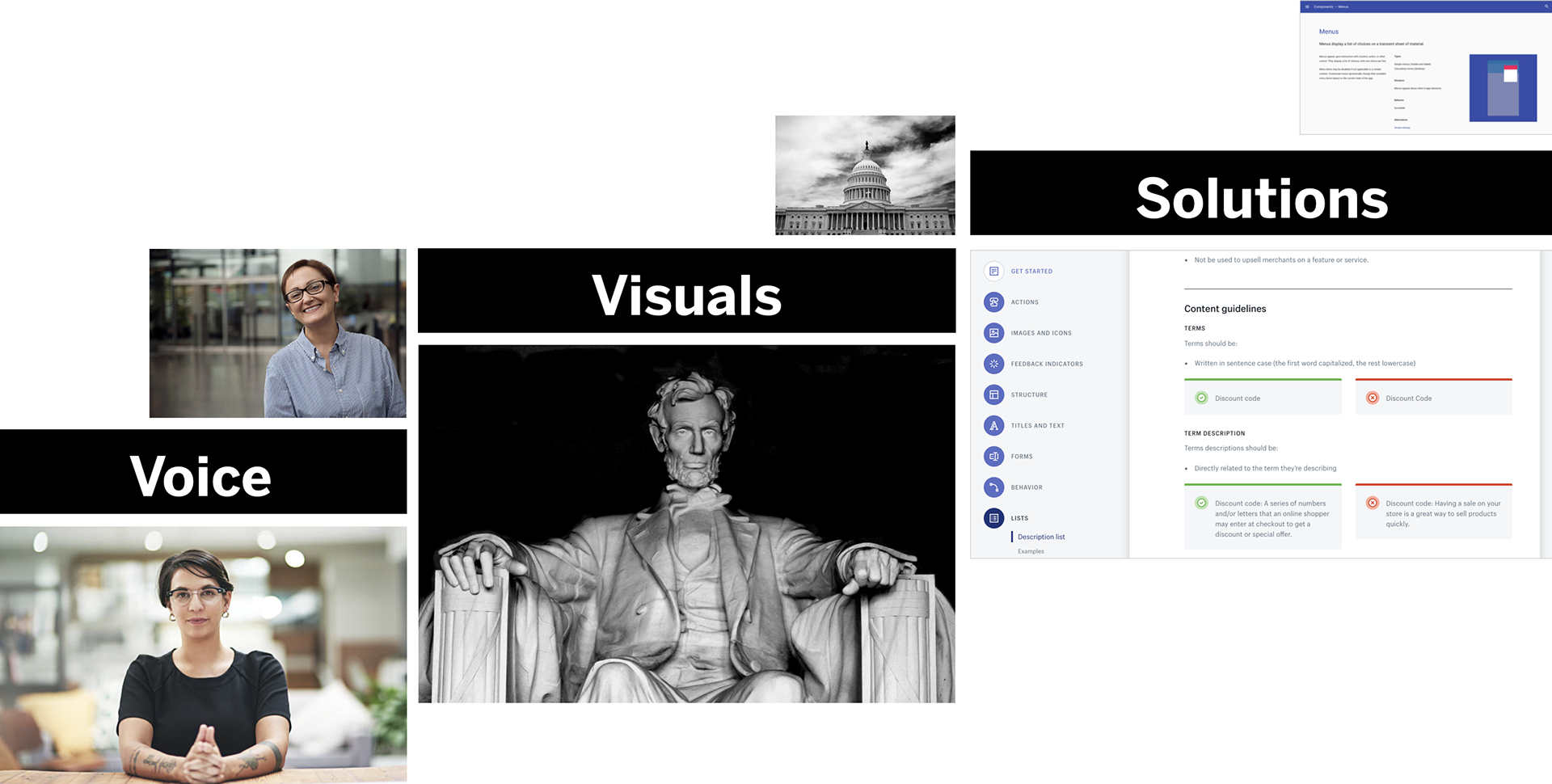
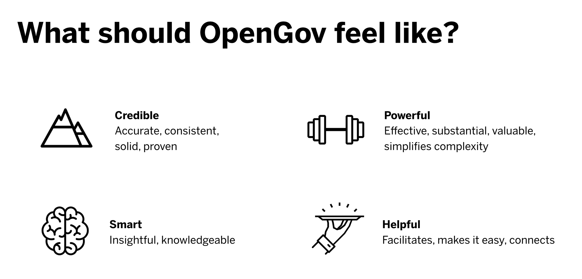
Based on our company mission and understanding of customer needs, the design team worked with company leadership to create experience design principles. The principles are the foundation of what our customers feel when they use our products and how we make it happen. As a UX team, they help us make tough decisions and measure success.
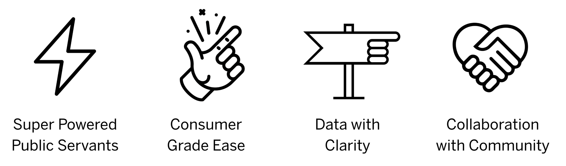
OPENGOV DESIGN PRINCIPLES:
Inspiration
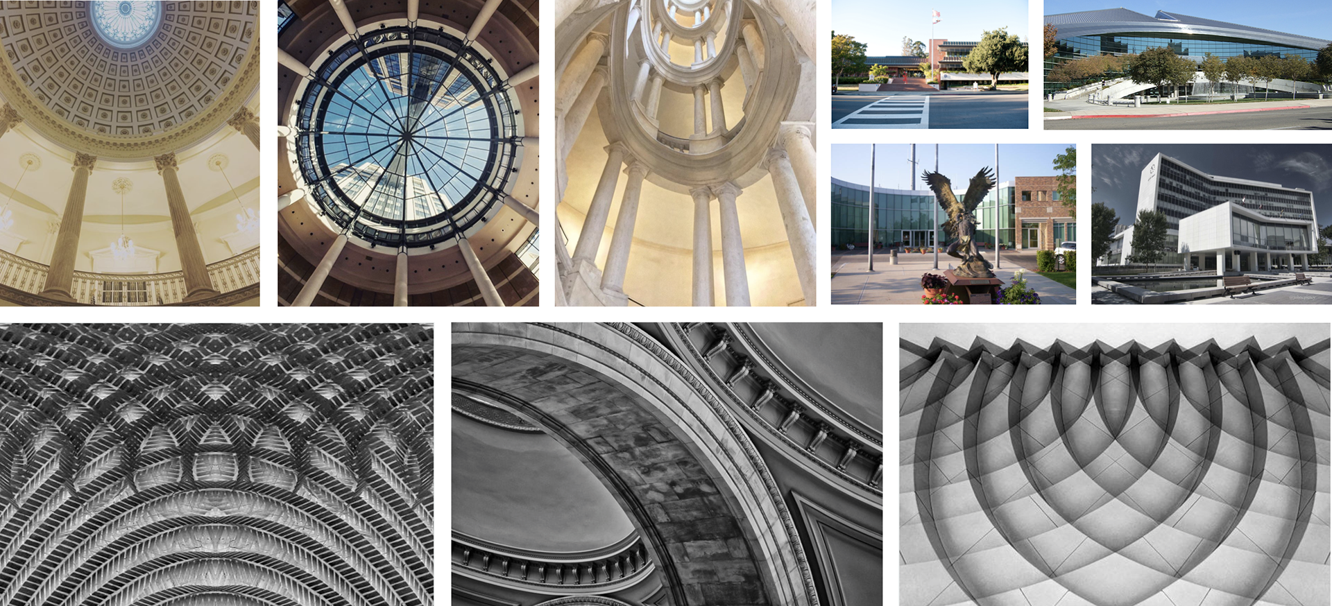
CAPITAL BUILDINGS
Capitals are both a physical interface between citizens and governments, but also a symbol of civic and community pride. We looked at real world and online architecture of public and government buildings.
Capitals are both a physical interface between citizens and governments, but also a symbol of civic and community pride. We looked at real world and online architecture of public and government buildings.
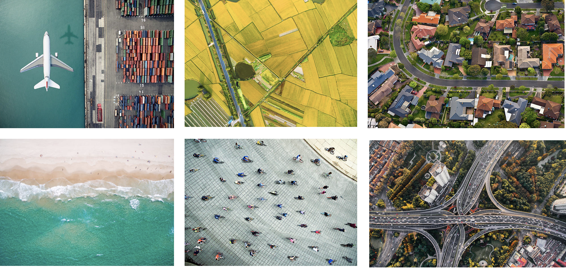
LANDSCAPE
Governments also are focused on landscape and infrastructure, so we looks at maps and aerial photography.
Governments also are focused on landscape and infrastructure, so we looks at maps and aerial photography.
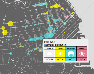
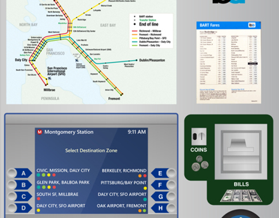
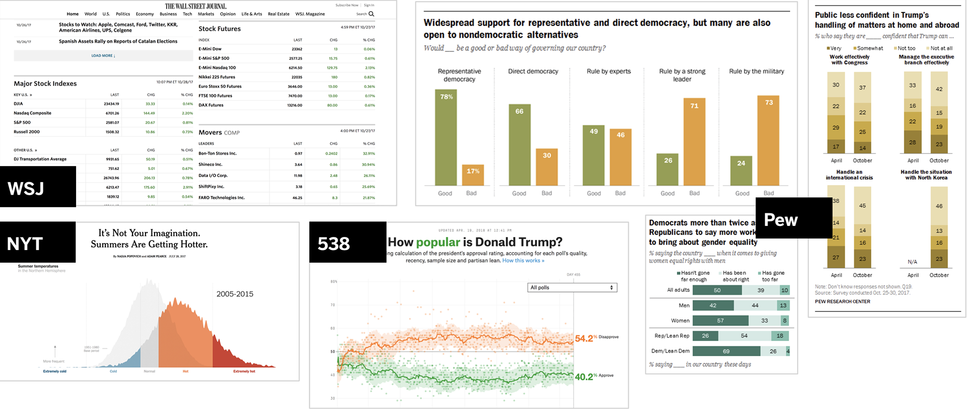
DATA
A key aspect of our products are data visualization, so we regularly look for inspiration and best practices in charts, maps, and data journalism.
A key aspect of our products are data visualization, so we regularly look for inspiration and best practices in charts, maps, and data journalism.
TEXTURE
We also wanted to instill our language with credibility and trust, so we looks at style in currency and engraved documents.
We also wanted to instill our language with credibility and trust, so we looks at style in currency and engraved documents.

Elements of Design Language
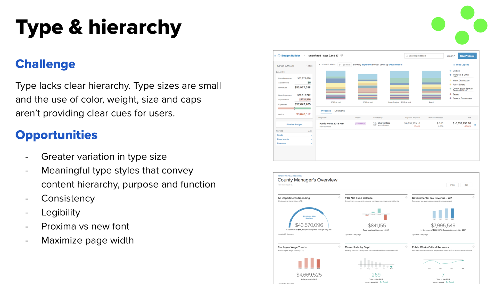
After exploring different directions we could go we worked on key elements of our language. The OpenGov brand colors, design principles, navigation, and product work together as a visual language with a voice and personality we honed in sketch, workshops, and mockups. We made high-impact choices on font and color.
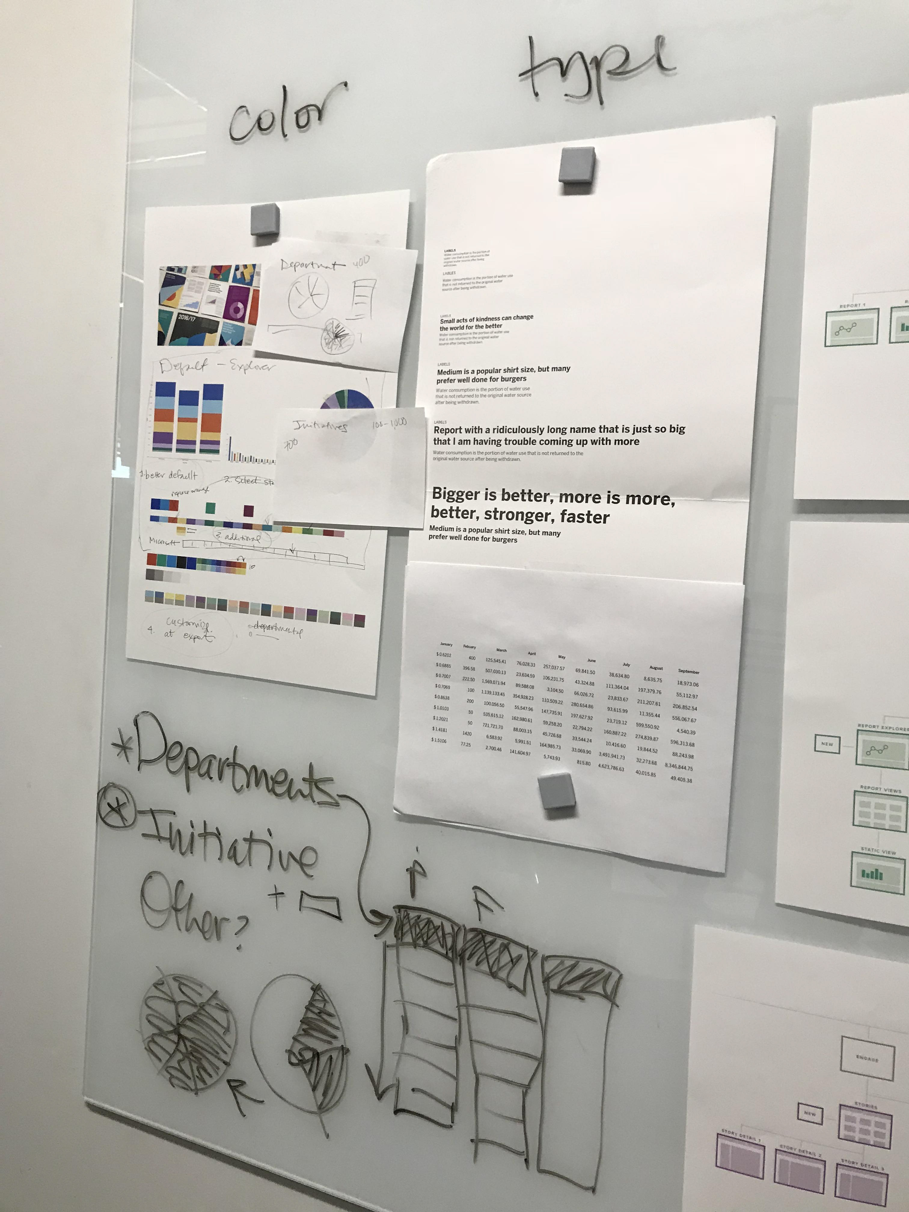
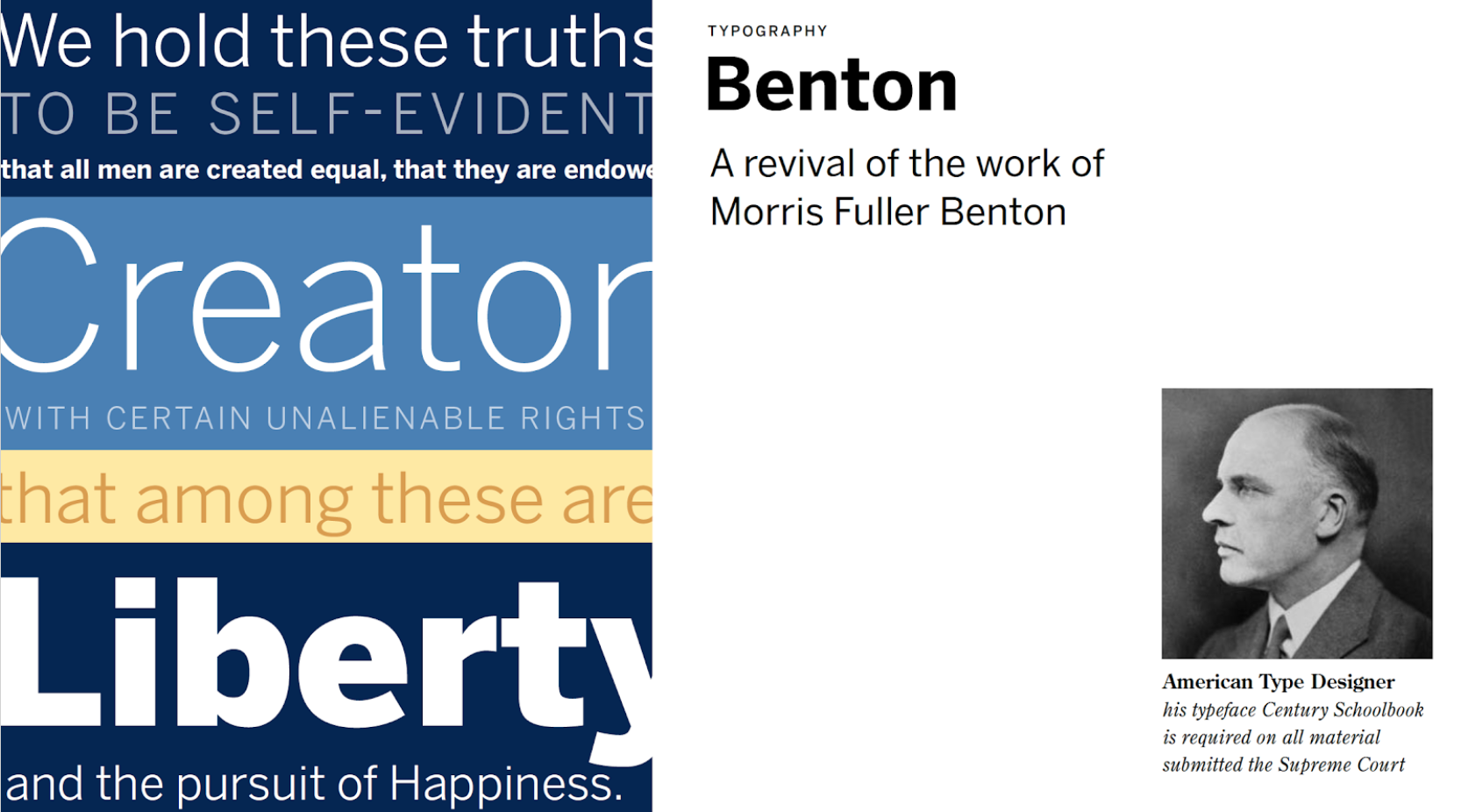
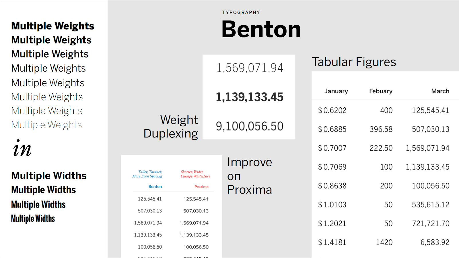
TYPE
COLOR
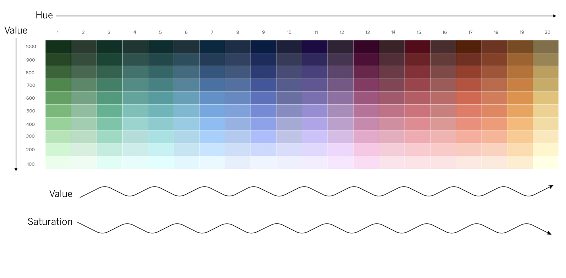
An color system that is accessible and works for data visualization, branded elements, and product UI.
An color system that is accessible and works for data visualization, branded elements, and product UI.
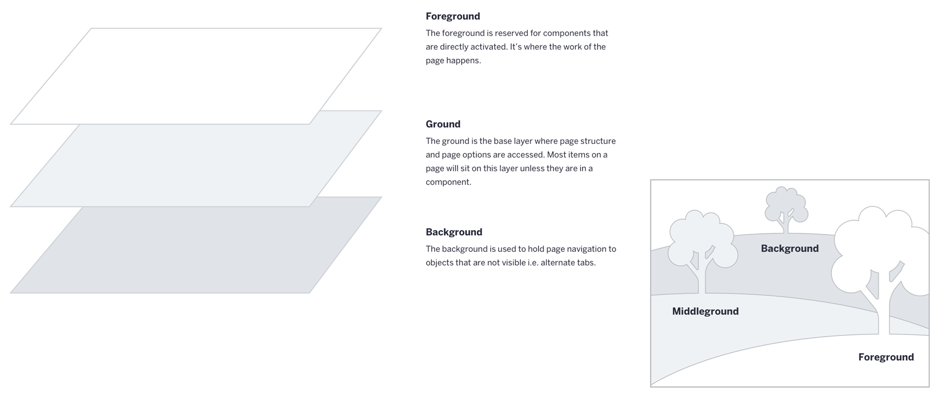
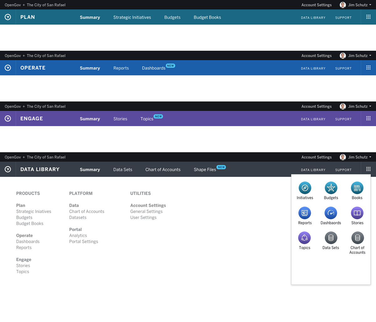
Future-Looking information architecture and wayfinding concept, that provides clear hierarchy and colors for multiple products or apps.
Design
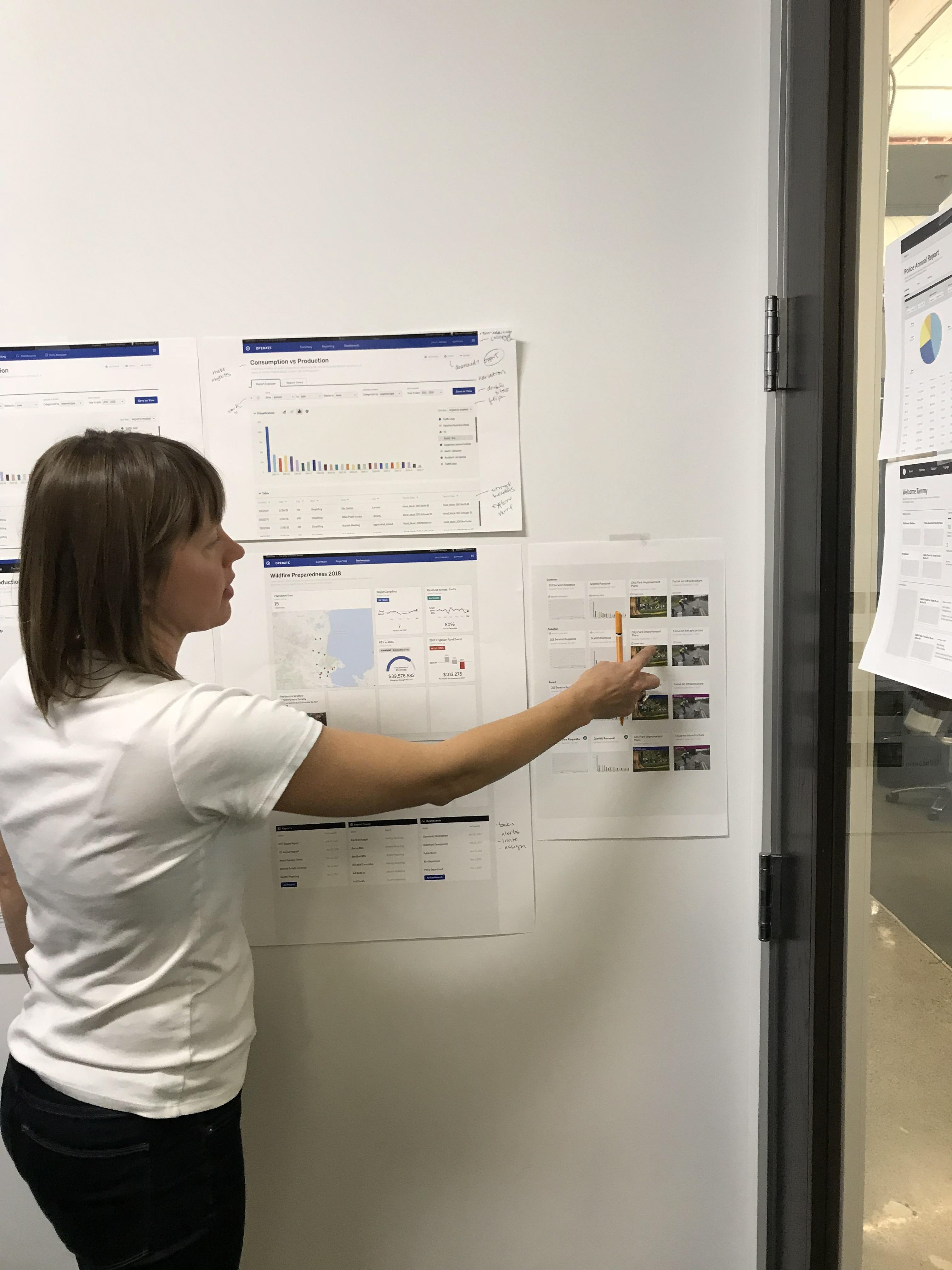
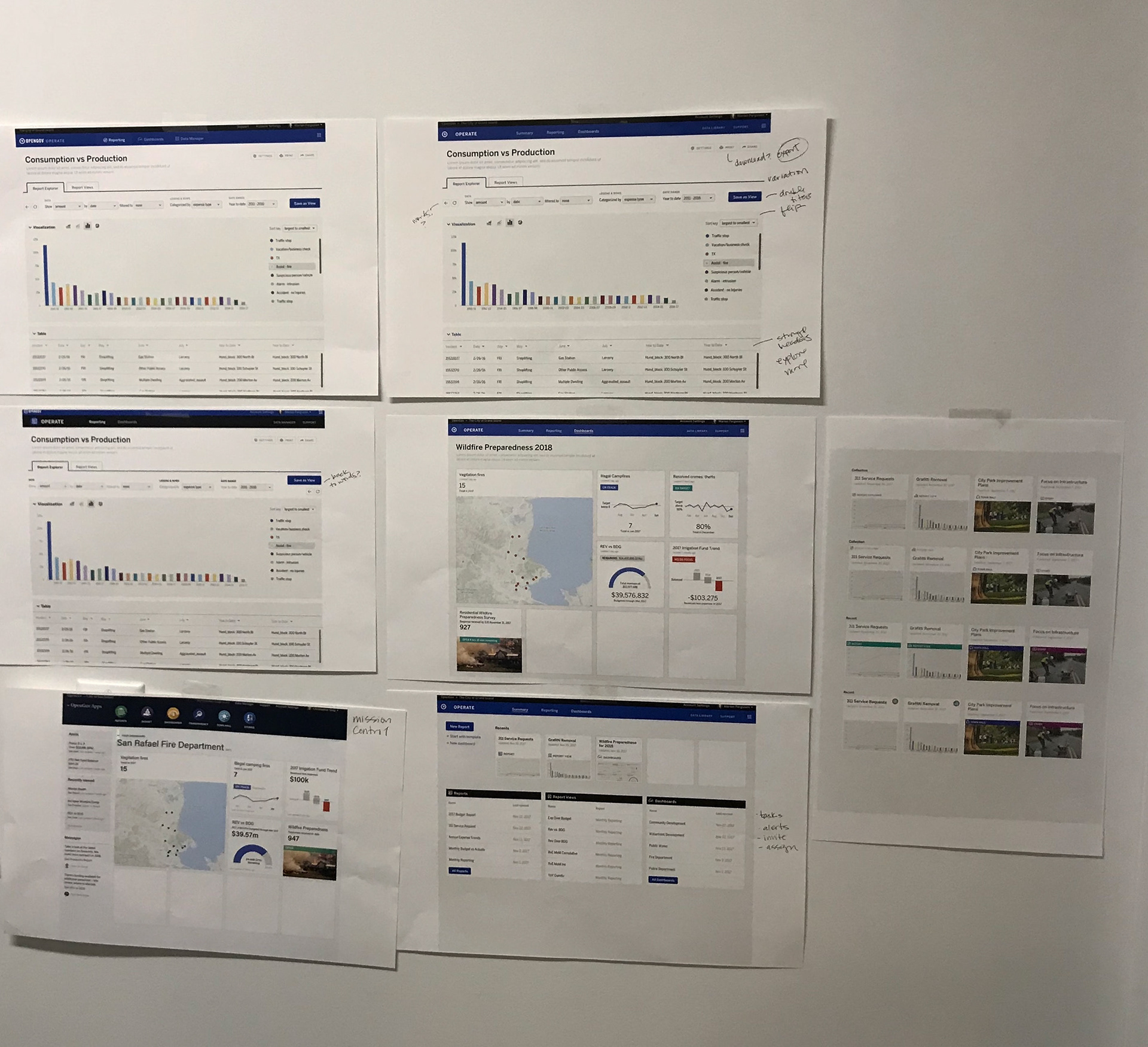
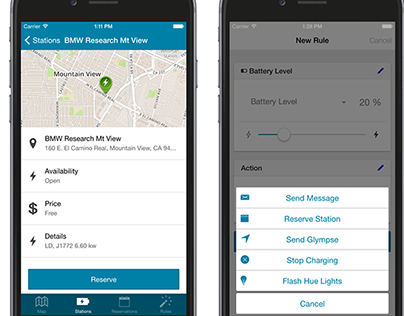
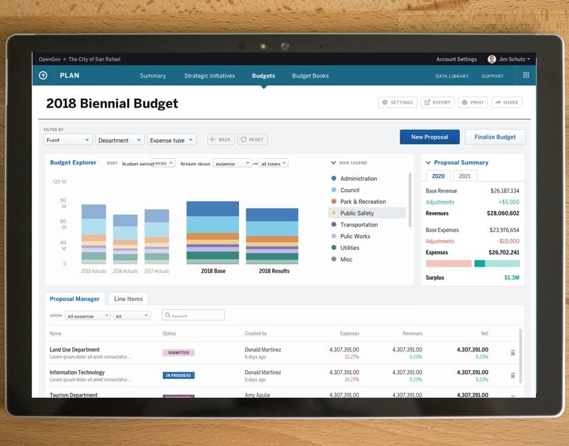
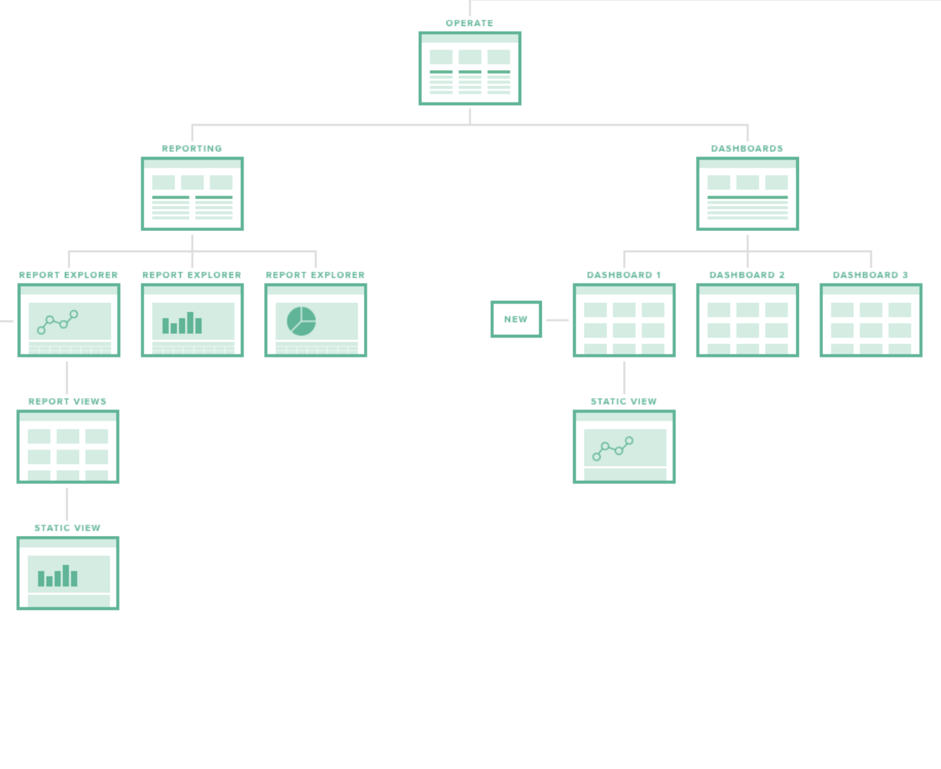
Once we had a fluent design language we design modular UI components that worked a holistic system. This was a collaborative, laborious, and often fun part of the process.